
The Science of First Impressions: Why Some Clients Connect with Your Therapy Website (and Others Don’t)
We all know first impressions matter—but when it comes to your website, they happen faster than you think. Like, way faster.
According to a study by Google, it takes just 50 milliseconds for someone to form an impression of your website (Lindgaard et al., 2006). That’s less time than it takes to blink.
So what’s happening in those first few seconds—and why do some people click away while others stick around and say, “This feels like the right fit”?
Let’s break it down.
1. Visual Appeal Isn’t Optional—It’s Neurological
People make snap decisions based on how a site looks before they ever read a word. That’s not shallow—it’s how our brains are wired.
Researchers call this the aesthetic-usability effect: if a site looks clean and polished, we assume it’s easier to use and more trustworthy—even if that’s not technically true (Kurosu & Kashimura, 1995).
What to Avoid
A site that looks disjointed or visually chaotic can trigger an instant nope. Even if they can’t name what feels off, visitors will feel it.
Mismatched or overly stylized fonts
Clashing or harsh color combinations
Low-quality or overly generic stock images
Inconsistent spacing or formatting from page to page
Instead, Try This
Make your site feel calm, cohesive, and inviting at first glance.
Choose a soft, cohesive color palette
Use warm, high-quality photos that actually reflect your vibe
Stick with simple, easy-to-read fonts
Keep the layout consistent across your site

2. People Scan Before They Read
According to Nielsen Norman Group, most people read only about 20% of the text on a web page (Weinreich et al., 2008). That means your layout and headings matter just as much—maybe more—than your paragraphs.
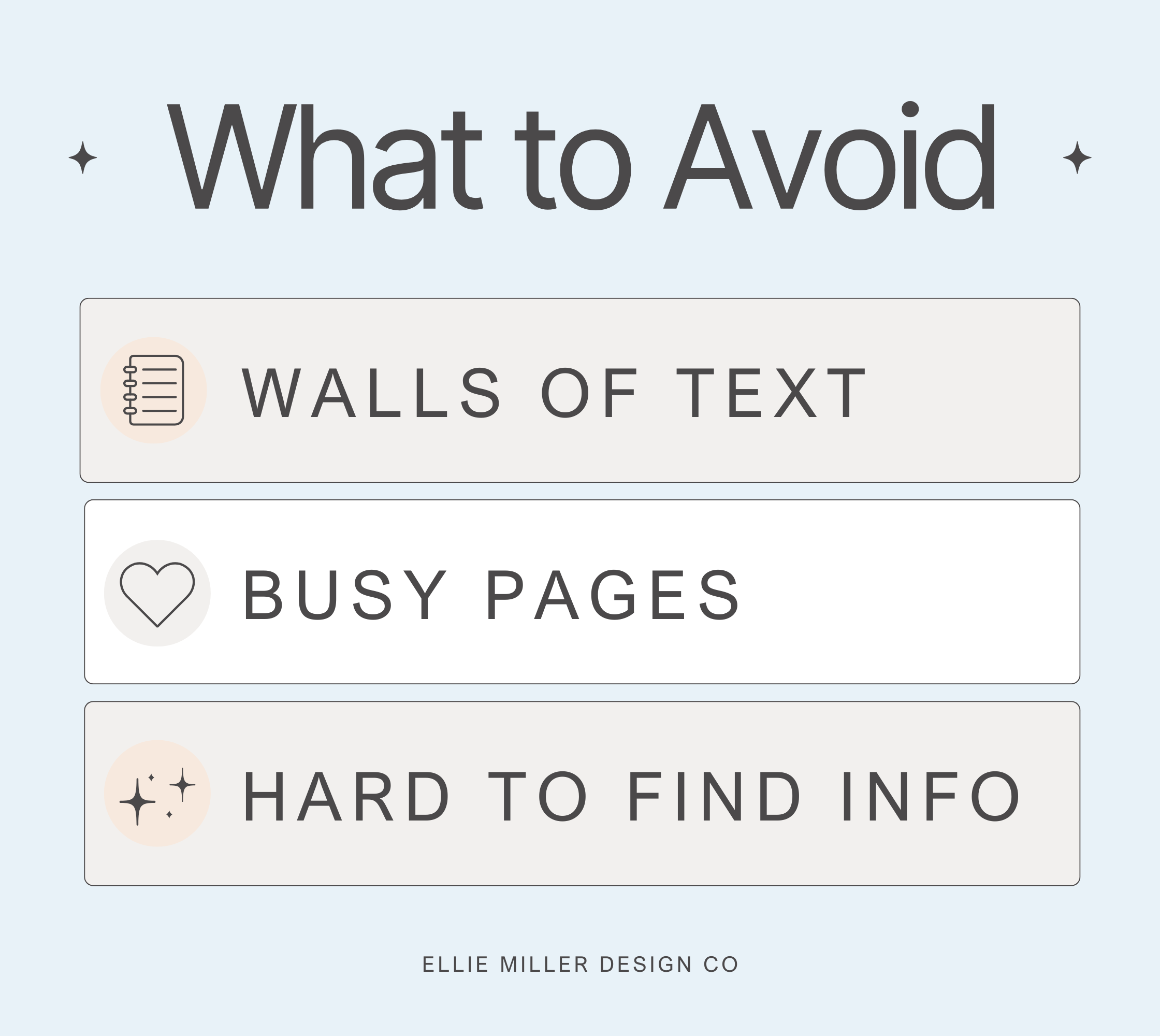
What to Avoid
Dense blocks of text that feel overwhelming or confusing.
Long, unbroken paragraphs
Vague or generic section headings
Busy pages with too many competing visuals
Buried or hard-to-find info about how to contact you
Instead, Try This
Make it skimmable and easy for someone to find what they’re looking for.
Break up text into short paragraphs and bullet lists
Use headers that speak directly to your ideal client
Put your most important info near the top of each page
Make sure your call to action is easy to find and click
3. Emotion > Information
Yes, people want to know you’re qualified. But what really draws them in is feeling understood. If your site reads like a textbook or a LinkedIn profile, it’s going to miss the mark.
Research shows that emotion is a central part of decision-making (Bechara et al., 2000). We connect first with how something feels—then we look at the facts.
What to Avoid
Dry, clinical language that doesn’t reflect your actual tone.
Listing credentials with no context
Heavy use of jargon (even if it’s accurate)
A detached or overly formal writing style
Copy that sounds like it could belong to any therapist
Instead, Try This
Write the way you talk—with warmth, empathy, and clarity.
Reflect what it feels like to work with you
Use phrases your clients actually use
Keep the tone grounded, not preachy or robotic

4. Too Many Choices = No Choice
When people land on your website, they’re already juggling a lot—especially if they’re in distress. If your site throws 12 tabs, 3 service options, and 4 calls to action at them? Their brain goes, “Nope.”
This is called decision paralysis (Schwartz, 2004), and it’s real.
What to Avoid
Giving people too much to choose from with no clear path forward.
Overloaded menus or dropdowns
Pages trying to speak to everyone
Multiple buttons competing for attention
A homepage with no clear hierarchy
Instead, Try This
Guide your reader toward one clear next step.
Use one primary CTA per page (like "Book a consult")
Keep menus simple and intuitive
Write your homepage like a story—start with the hook, then guide them toward action

5. Trust is Felt Before It’s Proved
Visitors don’t need a full site audit to decide whether you feel trustworthy. In fact, research shows that first impressions online strongly impact perceived credibility (Fogg et al., 2003).
They’re picking up on subtle cues: your tone, your photo, your language. They’re wondering: Does this person seem warm? Safe? Real?
What to Avoid
Anything that feels stiff, impersonal, or disconnected from your real-life self.
Overly corporate or cold stock photos
Language that feels scripted or formal
Design choices that don’t align with your personality
Lack of inclusivity or representation in visuals and copy
Instead, Try This
Let people feel who you are before they even meet you.
Use a welcoming, natural photo of yourself
Write in a voice that reflects how you show up in session
Show (don’t just tell) that your practice is inclusive and values-driven
Choose a design style that matches the tone of your work

A Real-Life Example: Before + After
Let’s say you’re a trauma therapist in private practice. Your original website had a lavender background, four different fonts, and said things like, “I use an integrative, client-centered approach.”
You weren’t getting many inquiries—and when you did, they were from people who weren’t a great fit. You didn’t feel great sending out your link, either.
Then you refreshed your site with a calming neutral palette, warm headshot, and messaging that said:
"You’re thoughtful, sensitive, and constantly managing other people’s emotions. Let’s make room for yours."
Soon after the refresh, you started hearing from people who felt like your people. The kind you feel excited (not drained) to work with. That’s the power of having a site that actually reflects how you work and who you help.
Quick Exercise: How’s Your Website Actually Landing?
Set aside 15–20 minutes to audit your site like a potential client. Imagine you’re visiting after a long, emotionally exhausting day. You're not here to admire design—you’re here to get help.
Use this checklist to guide your review:
Clarity: Can you tell who this site is for in 5 seconds? Would your ideal client feel seen?
Tone: Does it sound like you—or like someone trying to sound “professional” in a generic way?
Navigation: Is it easy to figure out what to do next? Can you find your contact info in under 10 seconds?
Flow: Is the homepage leading the visitor on a journey or dumping info all at once?
Vibe Check: How does the site feel emotionally—cold and distant, or warm and human?
Take notes without judgment. This isn’t about perfection—it’s about awareness. Once you’re clear on what your site is doing (and not doing), you can decide what’s worth improving.

Ready to Make a Change? Start Small.
After reviewing your site, you might feel like you need to change everything. You don’t.
Big shifts start with small tweaks. Choose one thing from your notes and tackle that first.
Here are a few doable starting points:
Swap your homepage headline for something more client-centered
Replace one stiff paragraph with language that sounds more like you
Add a new call-to-action button that actually tells people what to do next
Update one image to something that feels warmer or more authentic
Move your contact info to the top of your site or add a sticky button
Need help figuring out what to say? My Copywriting Workbook walks you through writing authentic, client-centered copy that sounds like you—minus the guesswork.
Want design support and a strategy that connects? My therapist-specific Squarespace templates are built to make that first impression count—no tech headaches included.
And if you’re craving a done-in-a-day refresh with my eyes on your brand and messaging, the VIP Day is for you.
You don’t have to figure this all out alone. Start with one step—and let it build from there.

TL;DR: It’s Not About Being Fancy—It’s About Feeling Right
You don’t need a flashy website. You need one that:
Feels like you
Makes it easy for the right people to say yes
Does the heavy lifting while you’re doing your actual work
Want help with that?
Explore therapist-designed website templates that take the guesswork out of it.
Because your future clients are making decisions in milliseconds—and your site should make them want to stay.


References:
Lindgaard, G., Fernandes, G., Dudek, C., & Brown, J. (2006). "Attention web designers: You have 50 milliseconds to make a good first impression!" Behaviour & Information Technology, 25(2), 115-126.
Kurosu, M., & Kashimura, K. (1995). "Apparent usability vs. inherent usability: experimental analysis on the determinants of the apparent usability." Conference Companion on Human Factors in Computing Systems.
Weinreich, H., Obendorf, H., Herder, E., & Mayer, M. (2008). "Not quite the average: An empirical study of Web use." ACM Transactions on the Web (TWEB), 2(1), 1-31.
Bechara, A., Damasio, H., & Damasio, A.R. (2000). "Emotion, decision making and the orbitofrontal cortex." Cerebral Cortex, 10(3), 295-307.
Schwartz, B. (2004). The Paradox of Choice: Why More Is Less. Harper Perennial.
Fogg, B. J., Soohoo, C., Danielson, D. R., Marable, L., Stanford, J., & Tauber, E. R. (2003). "How do users evaluate the credibility of Web sites?: A study with over 2,500 participants." Proceedings of the 2003 Conference on Designing for User Experiences.